
Untitled (Photoshop Typography)
Influences: Glenn Ligon
This is a somewhat contrived and obvious response to the influence of Ligon’s work. I am trying to find a way to make comment on the effects of the privilege that stems from my whiteness, my middle-class status and the relationship between my heteronormative masculinity and patriarchy, has on minorities. I am becoming increasingly aware of that status and want to acknowledge the impact that I unconsciously and unknowingly have on others by simply being a white, middle-class, heterosexual man in a patriarchal society.
This work is evidence of a nascent idea, one not clearly and eruditely formed yet, but it is a starting point, especially useful in the face of the creative block I have been facing.
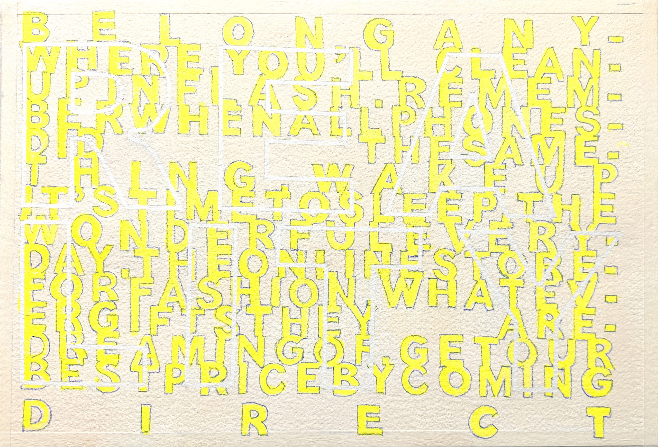
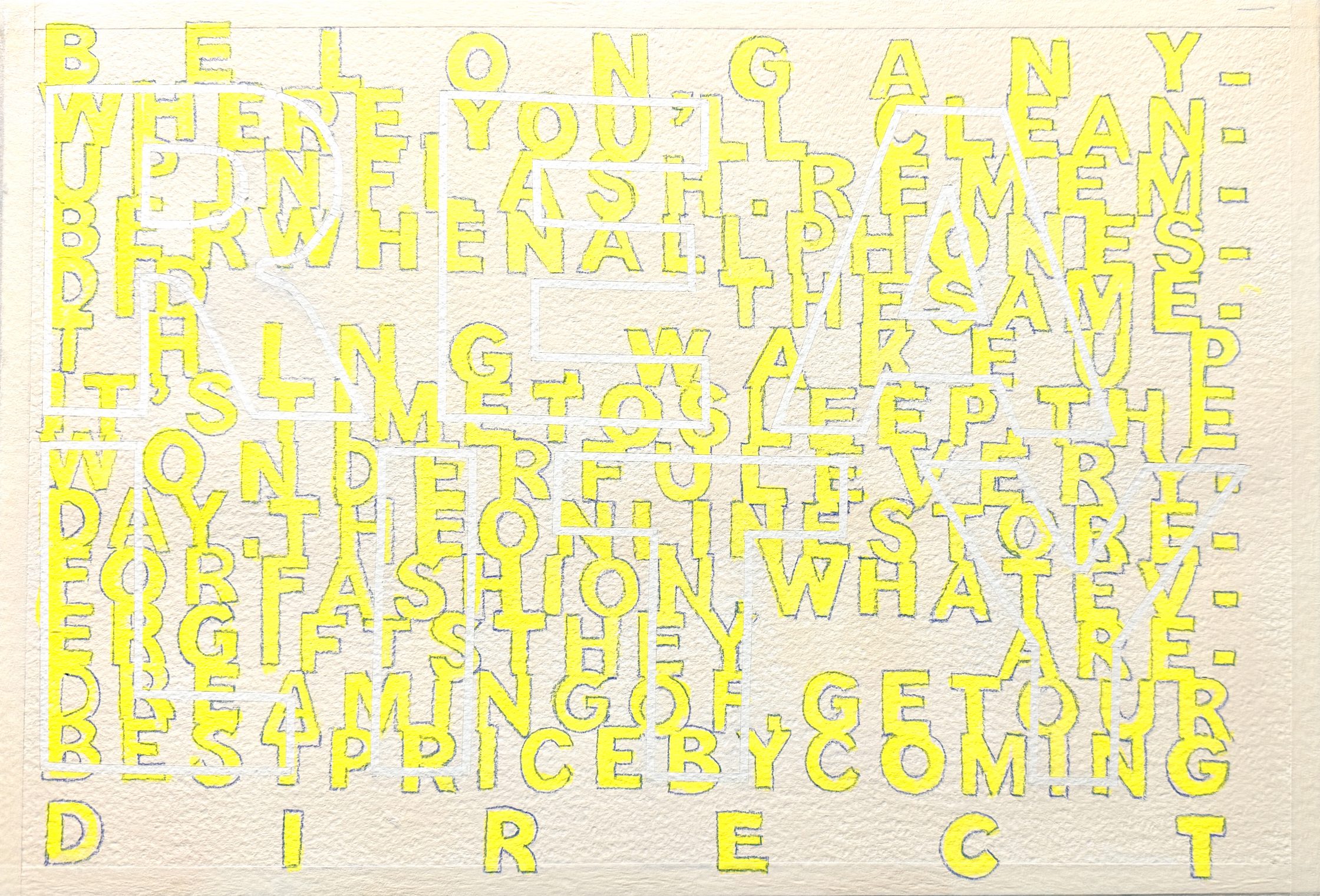
‘Untitled‘ (Gesso, acrylic, watercolour pencil and crepe tape on rough watercolour paper/ November 2024)
Influences: Michael Craig-Martin, Glenn Ligon, my Father
Craig-Martin for his use of crepe tape in marking-out the boundaries of objects and then the use of bright, acrylic colours to reflect on and disrupt our perception of those objects.
Ligon for his exploration of text, it’s readability, the meaning of words and the part that materiality can play in their meaning.
My Father was a very talented traditional signwriter, hand-painting notices, business signs etc around the local area. This is the beginning of a reflection on his skill with presenting words on a surface and at a scale that is outside of our normal, everyday A4 and screen-based boundaries.
This image is an attempt to comment on the barrage of advertising and media noise that is undermining our awareness of and connection to the reality of our lives. We are increasingly living our lives through the simulacrums of television and fictional presentations of how those lives should be. I think of the Christmas ads that I have been exposed to this past month or so, offering us vistas of happy families, endless food, expensive but affordable presents, the subtle but invasive demands to buy and the brands’ insistence that our lives will become better if we purchase what they are selling. Our lives are becoming directed more and more by unrealistic notions and expectations.
This rough painting features various advertising straplines painted in bright yellow, and outlined in electric blue to suggest the glow of TV pixels whilst their disjointed and merged presentation is reflective of the cacophony of the marketing hubbub that is always around us, always soaking into our unconsciousness in the hope of relieving us of the simulacrum that is our money. Obscured, barely visible without cognitive effort, is reality, marked out in white, created by masking the lettering with crepe tape. The pale ‘magnolia’ of the support, intended to be reflective of the colour of parchment or velum, the original support for the written word, especially the word of God, the source we refer to for the truth.
I have a vision of this sign-written onto a wooden board, along with others that comment on different aspects on my lived experience this way. Smooth glossy paint-work, crisp edges, considered typography. Artisan meets artist, concrete meets conceptual, traditional meets modern.
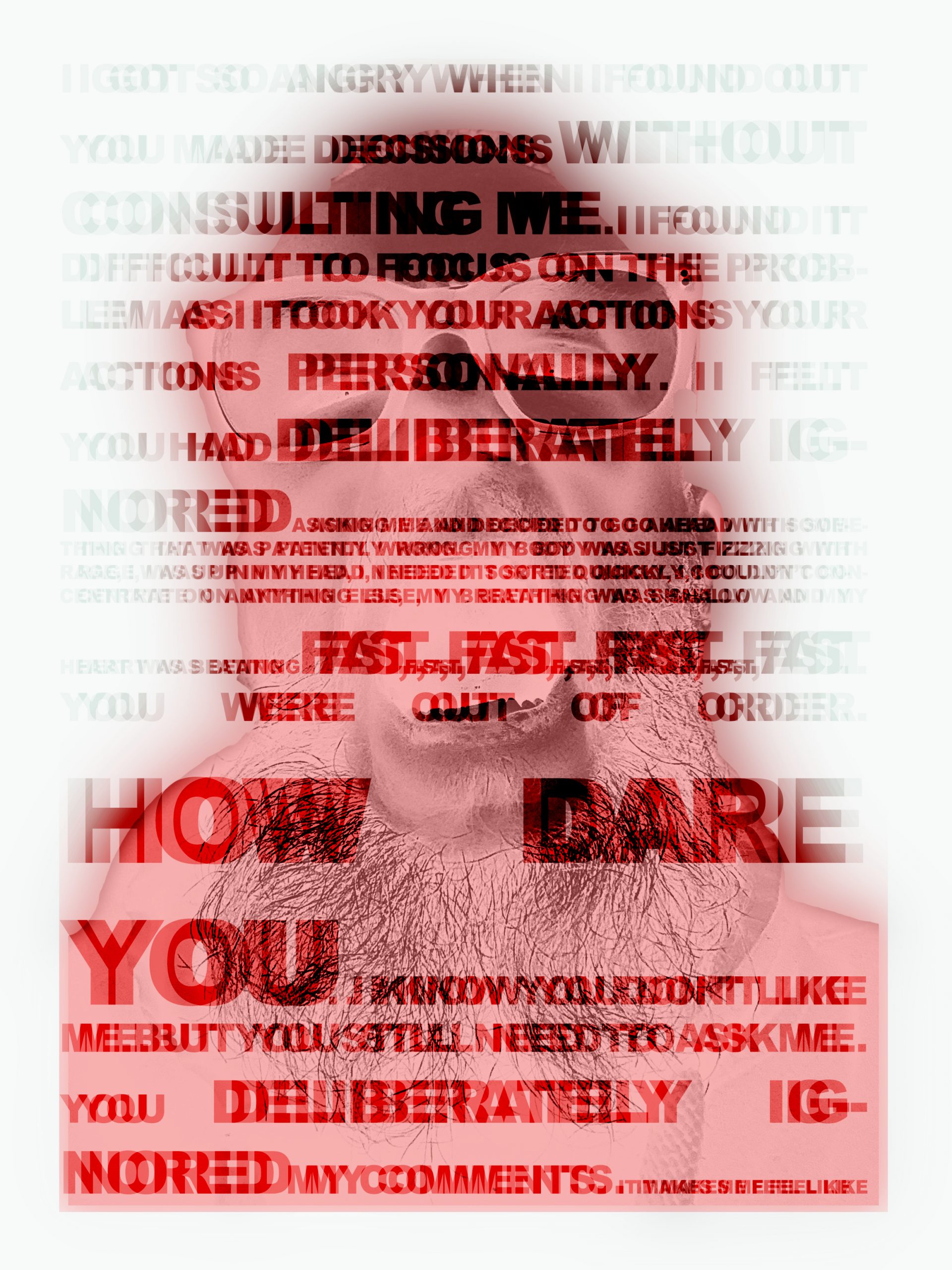
Untitled (Photoshopped typography and selfie / November 2024)
Influences: Glenn Ligon, again for his use of language, his exploration of text, the words and the effects of materiality on the physical manifestation of words.
Tracey Emin for how she explores her own lived experience through a variety of different media.
This was initiated by an experience that had been brewing at work for a few days, that then came to a head at a specific point in time. The text is a record of how I was feeling and what I was thinking (it was all merged into a noisy rage), its distortion and disrupted layouts an attempt to represent how the anger came and went in waves, and how it disorientates me as I rise up into my head, moving away from being able to ground myself. The ‘inversed’, negative selfie, both a visual reference point and a suggestion of the incandescence of my anger in response to the situation.
The work is a little contrived (the use of red is obvious), and there is still part of me that thinks I am being lazy developing work on the computer. There are also aspects that need greater consideration, principally the text, the layout of which needs I feel needs more thought.
A question I am asking myself is how can I approach this in a more painterly way, without offering up something that is merely a pastiche of another artist’s work?