
‘The Scar’
(Graphite and Watercolour Pencil on Rough Watercolour Paper: 21cm x 29.7cm)

Fig.1 ‘The Scar’
Influences: Tracey Emin, Jade Montserrat, Martina Mullaney, Evidentiary and Diagrammatic Art
Twelve years ago, I had an unfortunate accident where my dominant right arm was torn open by a dog. I underwent reconstructive surgery to reattach muscles and tendons, which was followed by nerve stimulation treatment as several controlling nerves had been damaged by the bite. That period of around 6 months, post operation, was probably one of the most fearful times of my life, as I was unsure I would regain full use of my arm: for a substantial portion of it I couldn’t raise my thumb or grip anything. Today, I am feel immensely fortunate and grateful that the only evidence I have are faint scars and a slight weakness in my right forearm.
This piece arrived out of frustration. Many of the subjects covered in project 6, whilst resonating with me emotionally and intellectually, were not sparking creative exploration – they were, to a point, not subjects I was interested in pursuing creatively, nor could I find a desire to explore ways of pursuing them creatively. Whilst I understand that this Unit is pushing my critical thinking, and thus trying to stimulate my own work, I am finding it is having the opposite effect. It presents subjects and themes that don’t fully resonate, makes me feel that there is a prescribed agenda for the themes and practices I should be exploring as an artist dictated to me rather than allowing me to discover my own, and doesn’t offer my themes or practices that connect with my lived experience. I am becoming more disconnected from creative practice as this unit progresses.
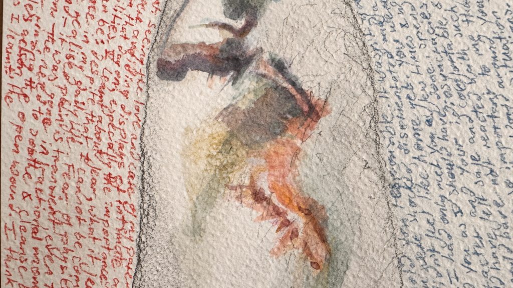
Fig.2. ‘The Scar’ (detail)
This was a prominent event in my life, that, even now, I have clear memories of. So, to overcome the creative block I have been experiencing, to sync with the themes presented by this unit, and to just begin making, it was an obvious direction to explore.
I have developed an interest in solving the problem of visually connecting writing, the written word, with a pictorial representation, how to make those two elements work together to deliver a ’rounder’ narrative. It is difficult to explain as the word is in itself a pictorial, representative ‘thing’: I am just not interested in exploring the word, the letters as the sole component of a work.
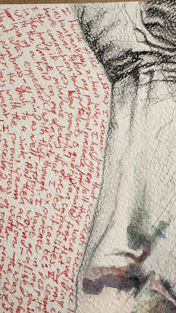
Fig.3. ‘The Scar’ (detail)
Tracey Emin’s work always comes to the fore when I am considering this problem: her nuanced and virtuoso ability to deliver an honest, vulnerable narrative in a painterly way, even when working in textiles or print or neon tubing is a passion of mine. But I don’t want to merely ape Emin.
This time though, Emin’s practice was competing for attention with Mullaney’s ‘Sugartits’ and Monstserrat’s ‘No Need for Clothing’ text pieces. I was moved, again, by their honesty and vulnerability and how they used the written word to deliver that creatively. But again I didn’t want to merely ape their work (that is an unfortunate side effect of the way this unit is shaped: we’re inundated and overwhelmed with looking at so many other artists, it is incredibly hard to find one’s own voice amongst the noisy academic demands). I was also contending with the influence of the evidentiary and diagrammatic practitioners studied in project 2. I had a desire to evidence a personal experience, but do so with a level of care in the actual act of creation. And that meant effort and time spent.
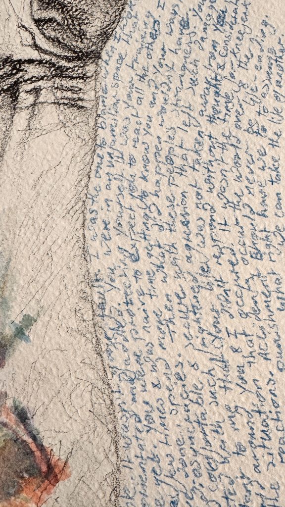
Fig.4. ‘The Scar’ (detail)
This piece is an attempt to respond to those influences – in my own way. Central is the drawing of my arm, specifically the scars. My arm is executed in graphite: it, in itself, just an arm, but it has been shaped by trauma and it is the trauma I want to bring attention to. I have heightened the scars, the artificial light that illuminates them (for the purpose of this drawing), rendering them in colour, exaggerating their presence to focus attention, to have the viewer ask what has happened. And then on either side of my arm, I have written a story of that event. Not so much a factual story of the accident, the operation and the aftermath. Rather a reflective emotional response to the accident (on the left of the arm, in red) and my feelings towards the dog (on the right of the arm, in blue) Neither of those perspectives need going into here. The colours for the writing were chosen from the colours I used to represent the scar. The wrapping of the text against the contours of my arm an attempt to describe how a personal history has shaped part of my physicality.
‘Untitled’
(Custom made door sign: 26.2 x 6cm)
Fig.5. ‘Untitled’
At the moment, this is a work without a well-rounded display context. It was an idea that jumped almost full formed into my head (à la Jeremy Deller), but one that lacked consideration for how and where it would be displayed.
I see a integrative psychotherapist on a weekly basis, and have been doing so for the past 5 years. I am very fortunate that I have access to that resource. But there are many people who do not, who can’t afford it, who need that support as much as me, many who need it more.
Thinking about the financial privilege I have and what it affords me access to in terms of therapy, I realised that there are millions of people globally who are denied access to healthcare in all its forms because of their skin colour, their gender, their weight, the religion, their nationality, their financial status, because of conditions they may already have, – and many, many other factors. I, like millions am privileged because I am white, male and heterosexual, factors that are accepted by the patriarchal ideologies that are the majority underpinnings of healthcare systems.
This work is a simple, straightforward, text-based response to that awareness. A standard door sign, typical of many doctors and hospitals, usually seen to indicate if a consulting room is occupied or not. Here though, it indicates access for the privileged whilst denying entry to the ‘other’. It also questions the audience, challenging them to consider which demographic they sit within, how privilege is actually qualified, what they are actually entitled to.
However, this piece feels like a component of something bigger, and intervention possibly, or an installation: it needs a context for it to operate successfully in.
‘Freedom from Want’
(Anchovy, olive, tomato spaghetti and mould in resin)
This piece takes its name from a painting by Norman Rockwell, showing a ‘sweet’, idealistic, sentimentalised view of a generational family of Americans gathered around a dinner table. The smiling faces, the middle class decor and the bounty of the large turkey, present a bountiful view of life. The patriarch at the head of the table, and the matriarch dressed in the ‘uniform’ of a housewife, reinforce the structural patriarchal ideologies at play in American society.

Fig.6. Freedom from Want (1943)
By purloining this painting’s title and applying it to a small resin sculpture containing rotting food, I am attempting to make a comment on the reality of food poverty and starvation for millions, if not billions, of people the world over. For them, the food that we the privileged waste could contribute to a meal, yet we discard it into landfills, compost bins, biofuel plants and so on. We discard food that is the wrong shape or carries slight imperfections. We grow and export cheap crops from poorer nations, yet we don’t distribute our bounty, equally and globally, unless there is a profit to be made. Privileged nations exercise resource & food discrimination for many reasons, but at the heart of it are the structural patriarchal systems and institutions that are the foundation of every privileged nation.
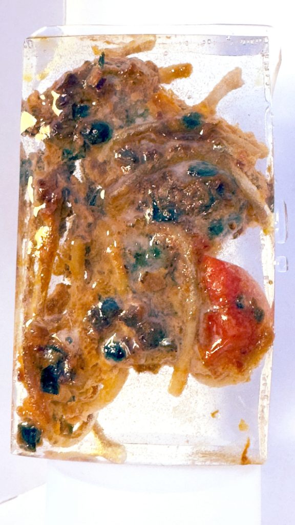
Fig.7. Freedom from Want
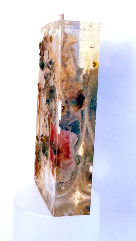
Fig.8. Freedom from Want
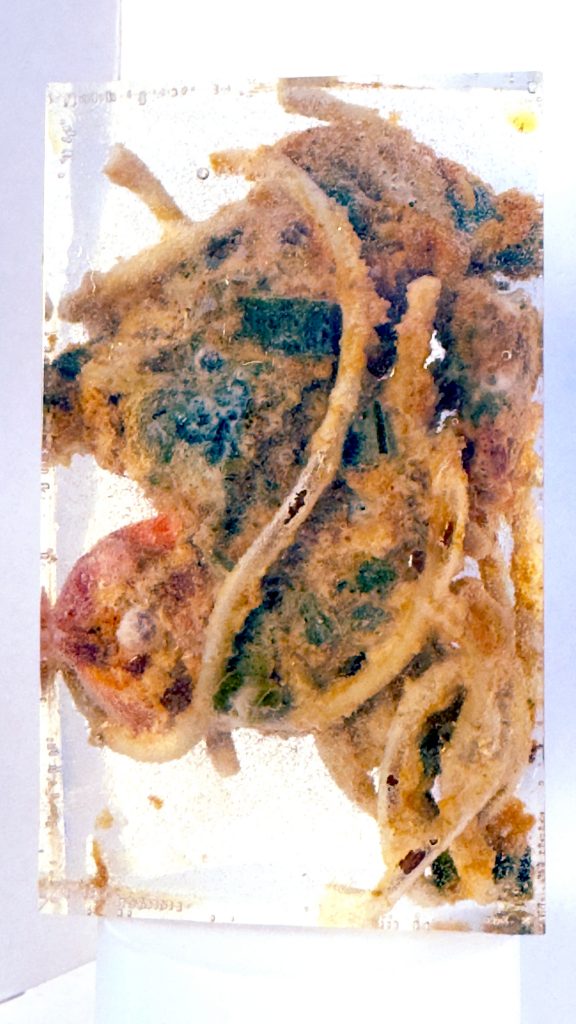
Fig.9. Freedom from Want
Fig.10. Freedom from Want
‘Adam’ (working title)
(Water soluble graphite pencil on pastel paper, resin and found objects: 64cm x 33.5cm)
‘Adam’ (working title) is my trying to tackle larger, more global themes, utilising and extending works I had made earlier on in the unit. It’s also another exploration into trying to solve the ‘combining-text-and-image-to-create-a-narrative’ problem in a single work.
I thought back to the resin objects I created earlier in the unit. My intention was always for these to attempt to discuss my perspectives on global themes – the world in crisis, climate change, the destruction of our natural world, fake news telling us conflicting lies. But at the time I made them, I saw them as distinctly separate objects, separate narratives, albeit with meta-narrative of the human-creature as causality.
However at this juncture, I realised there was an opportunity to connect them in the same physical space to communicate (possibly) both their individual themes as well as that overarching meta-narrative. This realisation came from much of the reading I was engaged in, not just for this course, but also on a personal level – bell hooks, Lola Olufemi, Nesrine Malik, the Guardian – and conversations I had been having with my partner and friends. From this reading I formed a hypothesis. That the problems in the world are the result of patriarchy and privilege. That abuse of power is a result of these two entrenched systems combined. We are seeing the evidence playing out in front of our eyes right now, but it has always been there. It’s just more present in our consciousnesses because of the overwhelming prevalence and power of various forms of media in our lives.
I had become aware that I was making most of the decisions about work I was creating in my head, and rapidly. Which isn’t very evidentiary for this learning log. The generation of this work I approached differently, using the sketchbook to document my ‘workings-out’. This didn’t mean producing just a raft of developmental sketches, but documenting my thoughts, how they were connected, how they iterated in whatever form that felt appropriate, primarily as a mind-map over several pages. I could write about those thoughts here…but I don’t want to – and I don’t see the point, as I have already documented them and the process in the sketchbook pages. Those are below.
Fig.11. Sketchbook development notes
Only so much could be cogitated on in the sketchbook and there came a point where the next round of decisions could only be made during the making process.
The scale of the piece was important for me. It needed to exist in between impactful and intimate, a place that attracted the viewers attention from a distance, but then forced them to come closer to assess the details. I wanted it to be landscape in orientation as a nod to the idea of this being a ‘data-driven landscape’, albeit one that reflected on the corruptive effects of patriarchy on our world. I wanted the words I wrote to be small, demanding effort, attention and focus from the viewer. And I knew I wanted it to exist in a frame, not purely for the sake of presentation, but to confine the work, to separate it from its surroundings, as another method of capturing attention and drawing it in.
The process of writing was cognitively, visually and physically intensive. I had to locate multiple respected sources for the data I wanted to use (WHO, UN, IUCN, Red List, UK Government etc). I had to extract the most relevant for my needs and then hand-write them, very small, on sequential lines, across a 64 x 33.5cm sheet of rough pastel paper, in watercolour pencil. Every 8-10 minutes or so, I would have to sharpen the coloured pencil I was using, the rough paper wearing it away quickly. I begun in colour, alternating different stats in different colours, and using different colour sets in relation to different data sources. Some way in though, my thoughts on the use of colour changed: I noticed that its use was arbitrary, a hangover from ‘The Scar’ (above), and there wasn’t a clear rationale to underpin it. My gut instinct was strongly saying ‘go one colour, just graphite’…data… zeros and ones…black and white. So I flipped the paper and started again. In all the creation of the text took around 6 hours, including the flip from colour to graphite.
Once that was finished, the next step was to test it with and without the resin objects within the frame. This is still an ongoing process. I have the frame laid on the floor, the written background and objects positioned, unfixed, under it. Every so often, I consider it, reposition the objects to see how they now relate. There is still an intense beauty to the framed piece as purely just the written background, and I am not sure if the resin pieces work harmoniously with the the background – I think the scale of the piece means that empty space is left around the objects which in turn creates a discordance. That may be what the piece needs. But I am also exploring creating smaller written backgrounds, 16x16cm, with even smaller text, both to challenge my process and the willingness of the viewer to engage.
Fig. 12. Detail of first attempt at written background, using coloured pencil

Fig.13. Reworking of written background in graphite (in process)
Fig.14 Finished graphite written background, framed
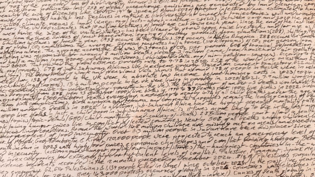
Fig.15. Detail of finished graphite written background
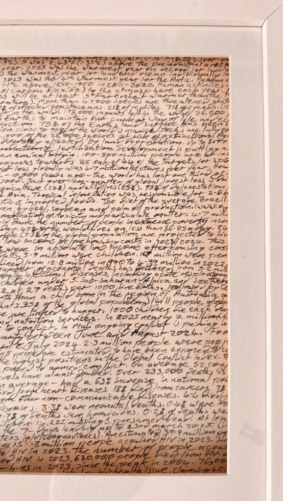
Fig.16. Detail of finished graphite written background
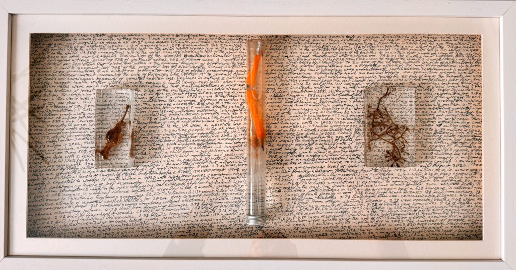
Fig.17. First test of all elements combined
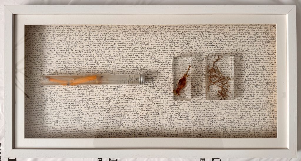
Fig.18 Second test of all elements combined
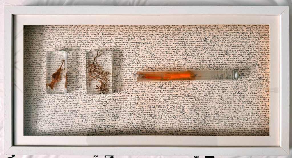
Fig.19. Third test of all elements combined
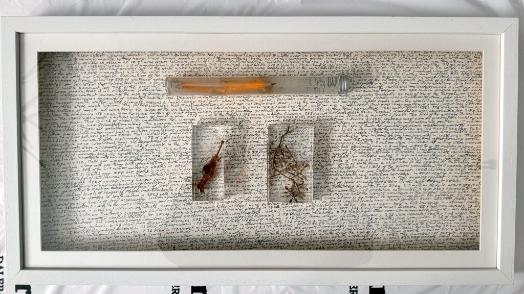
Fig.20 Fourth test of all elements combined
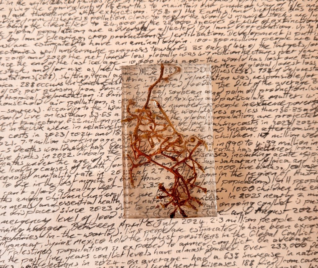
Fig.21 Detail of combined elements
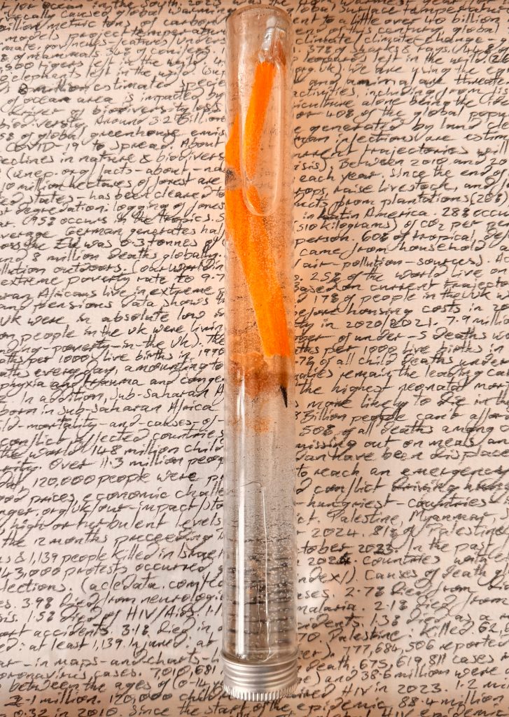
Fig.22. Detail of combined elements
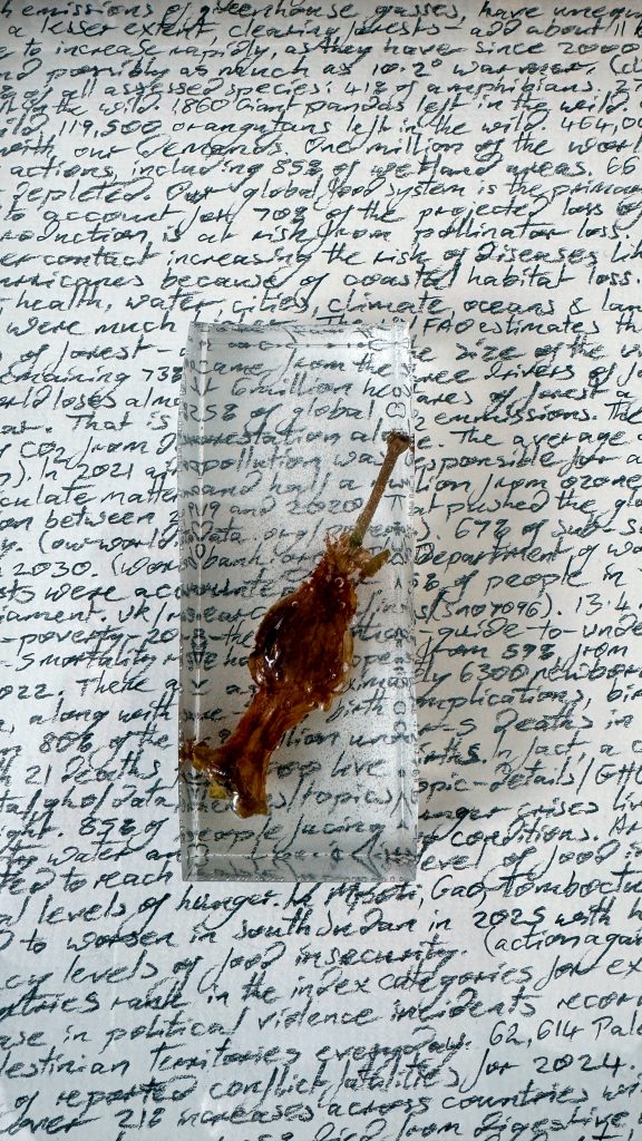
Fig.23. Detail of combined elements
List of Illustrations
Rockwell, N (1943) Freedom from Want [Oil on Canvas] At: https://www.inka.world/blogs/the-lunch-club/the-most-iconic-food-art-in-history (Accessed 23/04/25)