
‘Self’
(Digital painting/ 31.2cm x 44.2cm)
This piece has been stimulated (inspired feels like the wrong word to use here) by the recent Supreme Court judgement stating that women and men are defined by their biology at birth. As a white, privileged man with staunch feminist beliefs I am angry at this exclusionistic decision and the effects it will have on the structure of UK society. There is a contrariness between this decision and the UK’s ostensibly liberal leanings, one that will only lead to less inclusion, less tolerance, less diversity, more marginalisation and more fear. Feminism teaches us that our body does not determine our destiny, and nor should legislation, policies, or society’s expectations.
But I am most angry at how the establishment, its processes and its tools feels it has a controlling right over an individuals identity. For me, this is a form of state sponsored violence, a patriarchally-led oppression of people that don’t conform to what a small, privileged and empowered section of the population dictate, according to their ideology, as being ‘normal’. It is also a manifestation of what Spivak refers to as epistemic violence, the delegitimising of knowledge (and I include lived experience as a component of knowledge) of other groups of people. This is a pseudo-dictatorial decision in nature. And the process by which it has arrived is an abuse of democracy.
The written component of this work arrived quickly and formed from the thinking I am doing for my current work. That looks at how I can represent the ways I ‘interface’ with the world, not just the outward, physical responses, but my interiority, my thoughts, responses, feelings and emotions: essentially the components of my identity. Identity as an interface. What do I mean when I talk about myself? What are the determinants of ‘my self’?
As a white, straight man, the high court’s specific judgment doesn’t affect me. The nature of the decision potentially does though; it could be seen that the law and the government has tacitly given itself the right to exert, at some point, control over some aspect of my identity. From a personal standpoint, this piece speaks against that future possibility. I want it to act as a strong counter to remind our embedded patriarchal systems that my identity is mine, I determine who I am, the life-experiences I have had, the conditions of my upbringing – and so much more – are what give me my identity.
But I also have a loftier purpose: I want this work to speak for anyone, everyone – even the patriarchs – for it to be adaptable to talk to anyone’s identity. I want the patriarchs to understand they are entitled to their identity, they own it, it is individual to them. But I want them to understand their identity, their definition of it, is not to be foisted upon everyone else. I want them to see clearly, that their decisions come from an abusive relationship with power and privilege, not from a place of a so-called ideal of a norm. I want to remind our systems and our institutions that each of us in our own way is ‘my self’ and that should be respected, honoured, valued and cherished!
As I pondered on where my unique identity arises from, I began to list the elements, dimensions, experiences I considered as formative of my identity. In my understanding, I ‘possessed‘ those things – My arms, My Legs – and that My Self is formed from ‘possessing‘ them. As I wrote, the rhythm and meter for the narrative revealed itself – a two word possessive description of an ‘element’ aligned to the holistic possessive of ‘my self’. Repetitive 4 word phrases, capturing as many of my ‘identity elements’ as I could think of, relating them directly to ‘my self’. I had also begun to recognise I was riding my emotions, my anger, in surfacing the writing and, having had that awareness, I allowed that to lead me.
I begun segmenting and ordering this list into physical, internal and external elements. The thinking began with pencil and paper, then migrated into MS Word, where that segmenting manifested as 3 columns, meant to be read from top-to-bottom, then left to right. And seeing the words typed out, initialised a need for a declarative statement at the end, a rallying call, one that unambiguously stated my ownership of my self and pushed against attempts at structural control. Those words flowed serendipitously with little effort.

Fig.1. My original notes
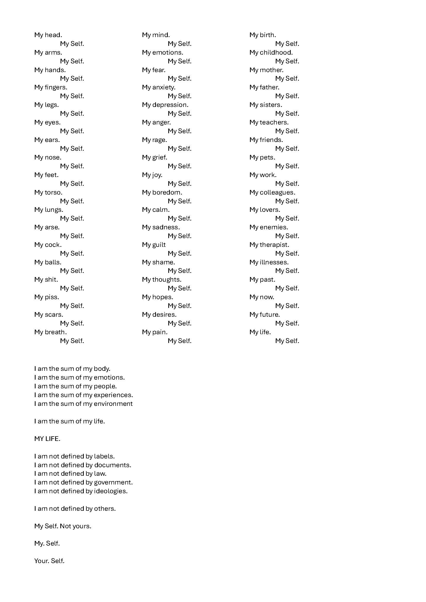
Fig. 2: First version, working out the flow in MS Word
Seeing the words typed out drew my attention to the need to consider the aesthetic of the piece: a Word doc wouldn’t suffice. There was rhythm to the words, in my head, that reflected the build up of anger I felt as I wrote, which needed to be reflected in the visual representation.
My first thought was the piece as a purely typographically work – probably the influence of my day job at work. So, I reproduced the Word piece in InDesign, beginning with matching the 3 columns. But merely reproducing the Word doc meant the piece occupied a passive space that lacked a sense of my anger. My thought then was to sequentially scale aspects of the text, My Self, to angrily reinforce the belonging of the ‘components’ to me. This approach did add a new layer to the visual rhythm, but it was obviously for me, not the correct aesthetic to carry the piece: it resembled too much, an old Letraset catalogue.
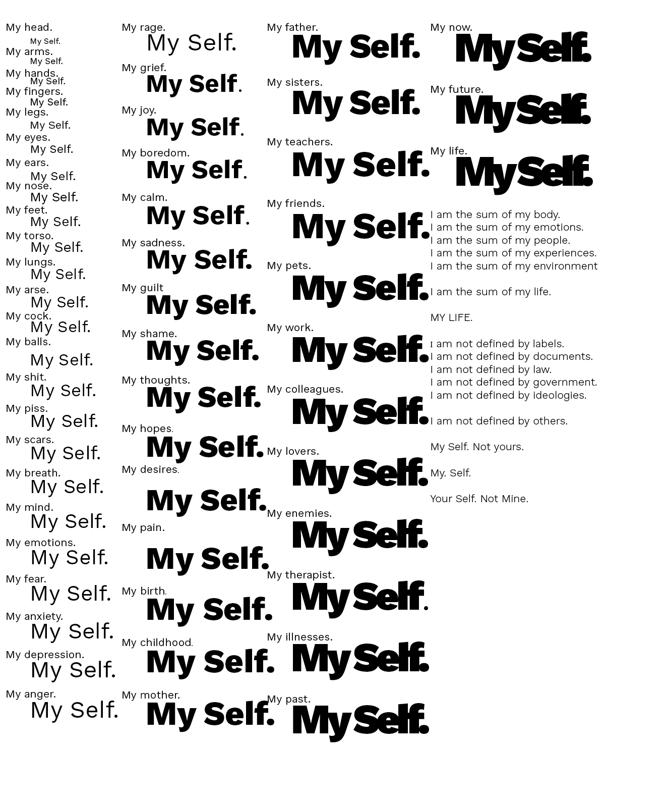
Fig.3. Vs2. mirroring the layout InDesign
I then decided to follow a more standard visual representation of a narrative – paragraph format – but with an alternate approach for representing my anger. All caps case was chosen for a layer of initial emphasis, with My Self reinforced further by the use of italicised pure black fonts. At the time I was still wedded to differing the text segments – physical from emotive, from experience, from the concluding declaration – so I used different colours to identify those segments. That is something that became less important as the process moved on as I began seeing the text as a ‘whole’ not a series of sections.
I also employed other techniques to emphasis my feelings: the increasing compression of the leading and kerning to suggest the rising speed and anger of what I am saying. The enlargement of specific words to emphasise the focus of my opinion.
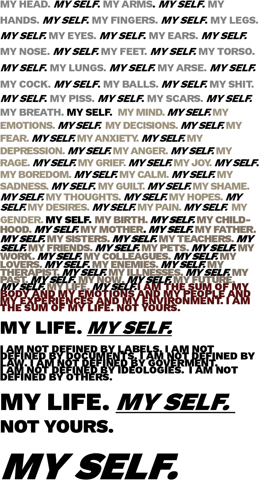
Fig 4: Version 4: looking for a way to represent the way I would speak it, and my anger
Earlier in the throes of this Unit, I had discovered Fiona Banner’s Superhuman Nude created in response to the 2012 Paralympics. I was captivated by her translation of the physical and motive presence of a para-athlete into a ‘life study’ of words. This had been the unconscious influence on my use of all caps for the text. Revisiting this work prompted me to consider if my work would benefit from a non-language visual element, a background of sorts. Banner’s work uses an image of wet paint, pooling, running and dripping from the top-left corner. Seemingly unconnected, the vibrant nature of these marks suggests (to me at least!) an organic creature dynamically existing across a space and a period of time. The movement is enhanced by the increasing left-sided indenting of the copy, and the reduction of the leading towards the end of the narrative.
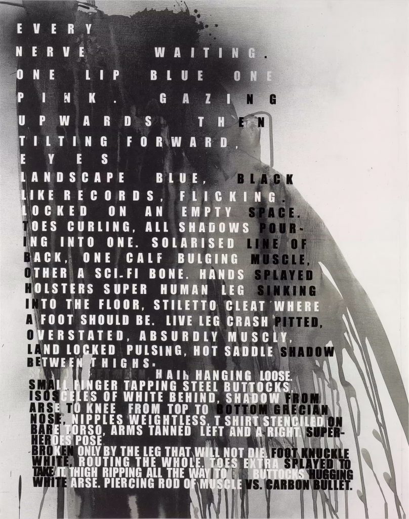
Fig.5. Superhuman Nude (2011)
I introduced an image of a large-scale oil painting I had completed last year, itself prompted by monoprints I had executed for UPM. Those monoprints examined how I could ‘explain’ my physical self, through an abstraction as a result of a reduction of marks. The scaling up to a 1.5 metre high painting was the next stage of that exploration, extending it through a somatic, gestural use of paint to push the abstraction further, whilst trying to retain a semblance of a reference to me. I played with different cropped images of this painting and then the relationship of the text above it, the colours and the layout, the most successful probably being version 7 below, where my intention was for the left hand edge of the text to suggest, loosely, the left-curve of the face.
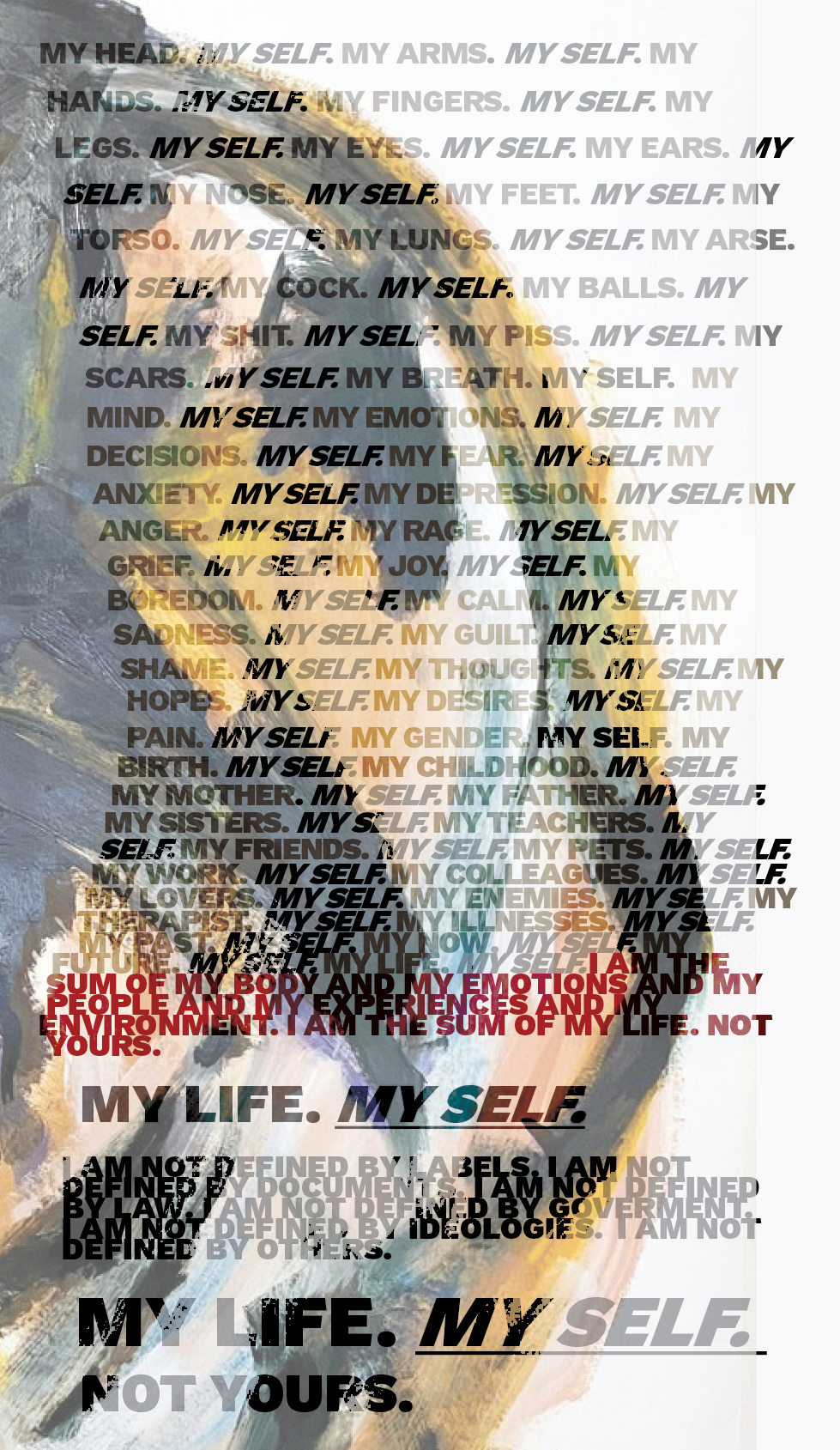
Fig.5. Version 5: Introducing a pictorial element
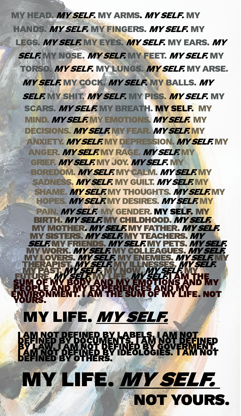
Fig.6. Version 6: Adjusting the text colour
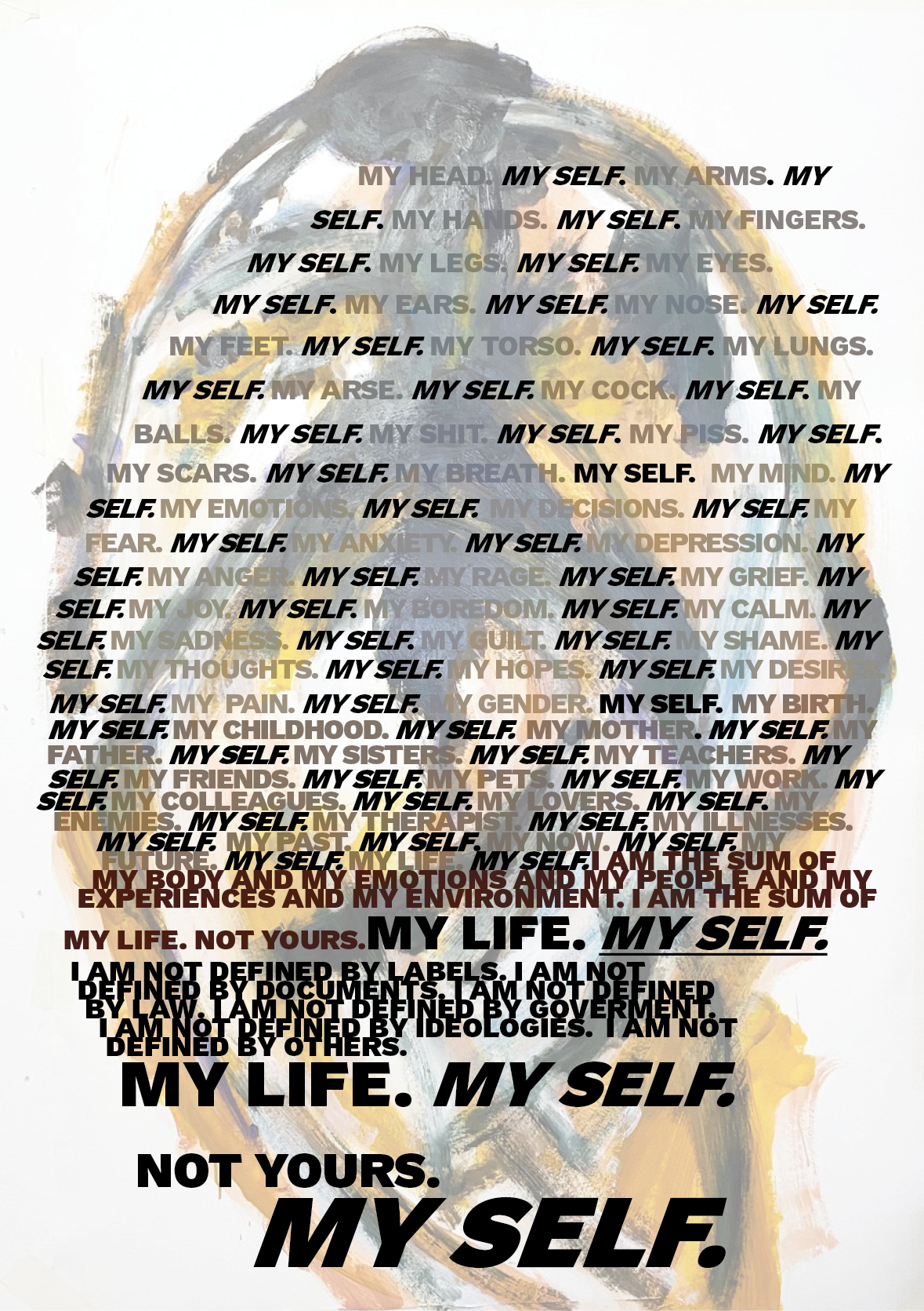
Fig.7. Version 7: Re-exploring the image and copy
Further explorations drew on Banner’s work more directly, introducing a Photoshopped selfied as the background element. My intent here was to introduce a more ‘recognisable figurative’ reference: these are more successful visually, but the begin to take the work towards the realms of design, and I am beginning to lose a sense of ‘my hand’, my self in the work. At the time of writing this, I am mulling on how I can bring this piece back into something that is ‘manually’ created rather than digital. This exploration, this ‘digital zone’ has reached its endpoint: I could continue ad infinitum producing more digital versions, but that will be taking me further, and further away from myself. and there is a laziness in that.
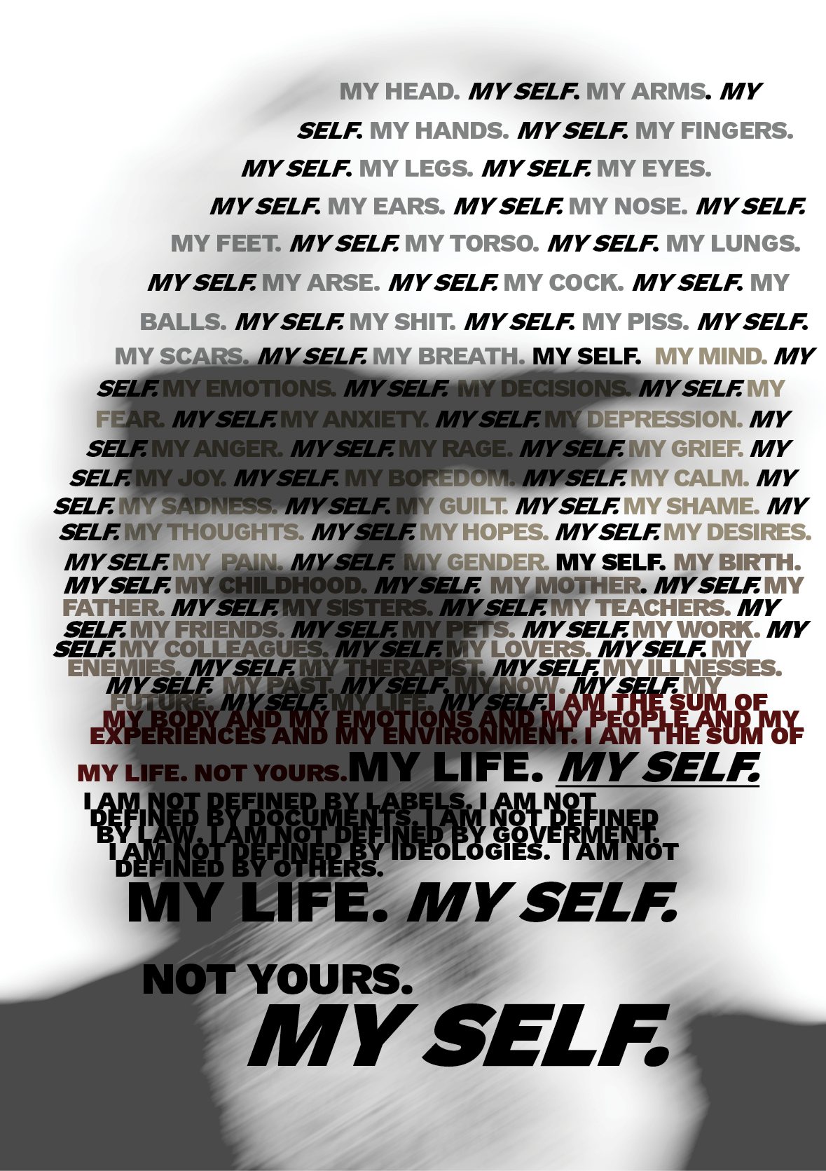
Version 7: Replacing the painted image with a Photoshopped selfie

Version 8: Alternate exploration of photo/ copy treatment
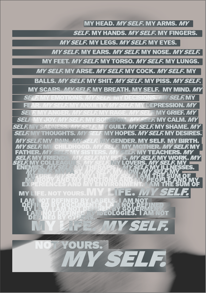
Version 9: Alternate exploration
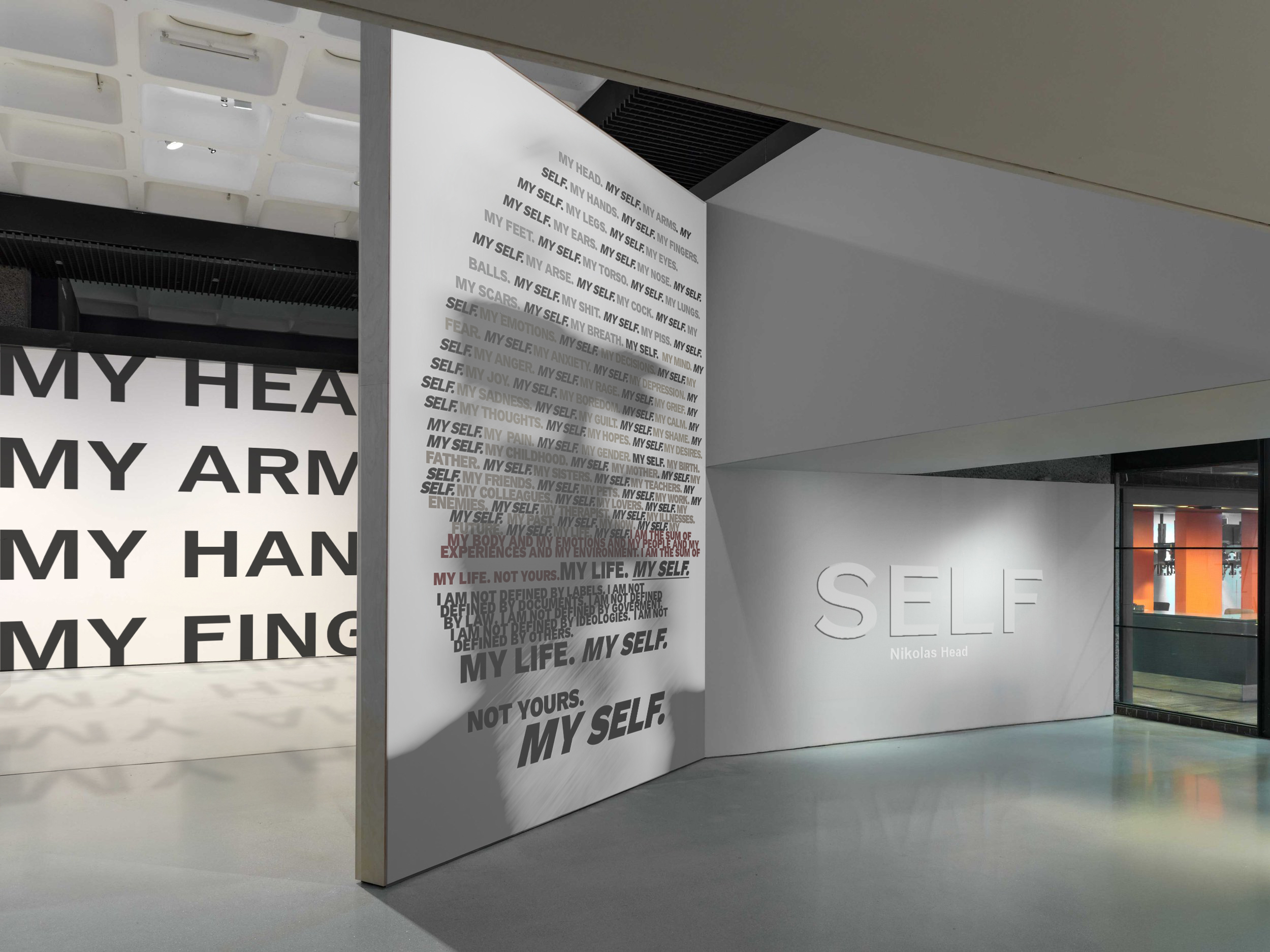
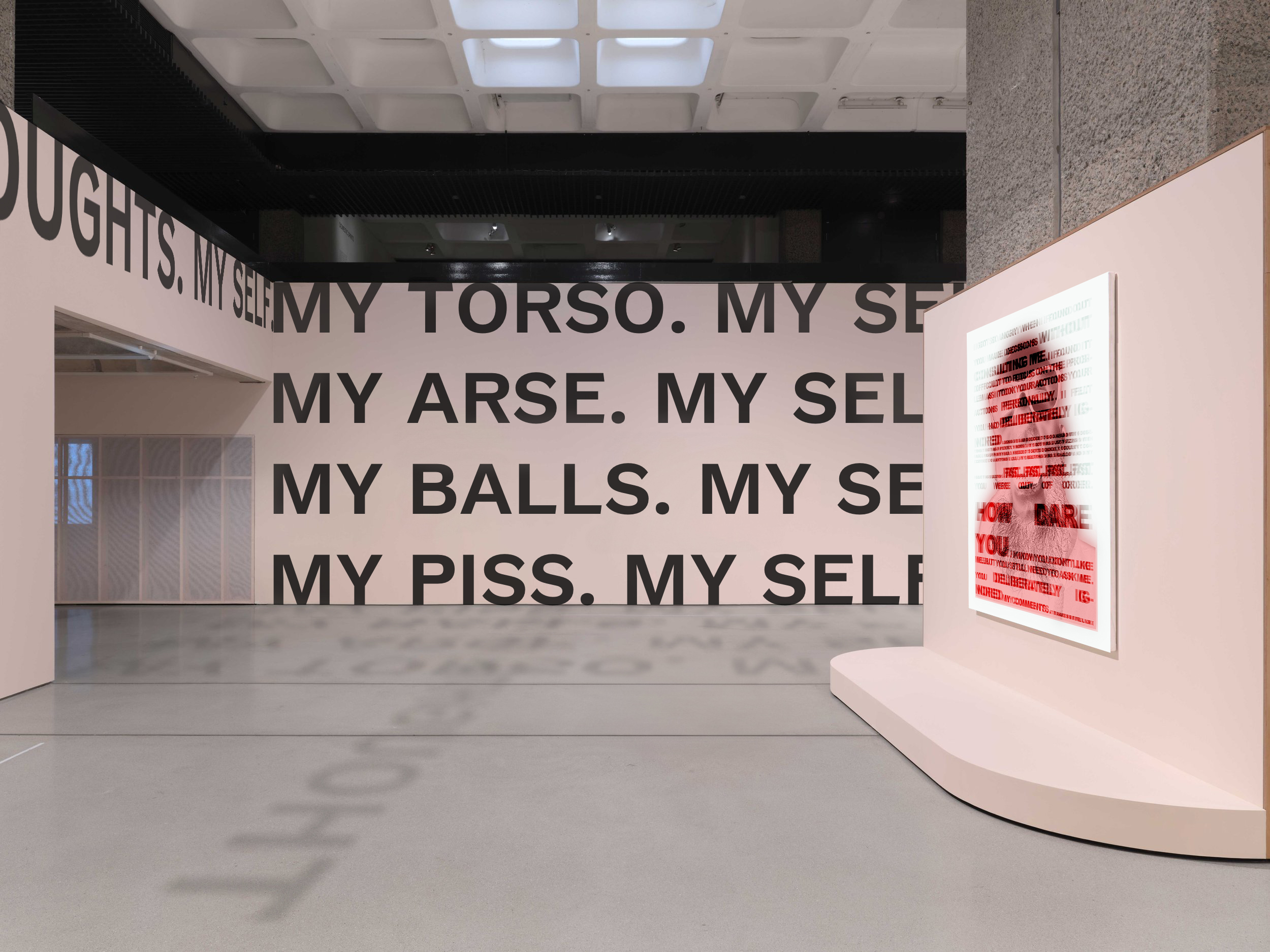
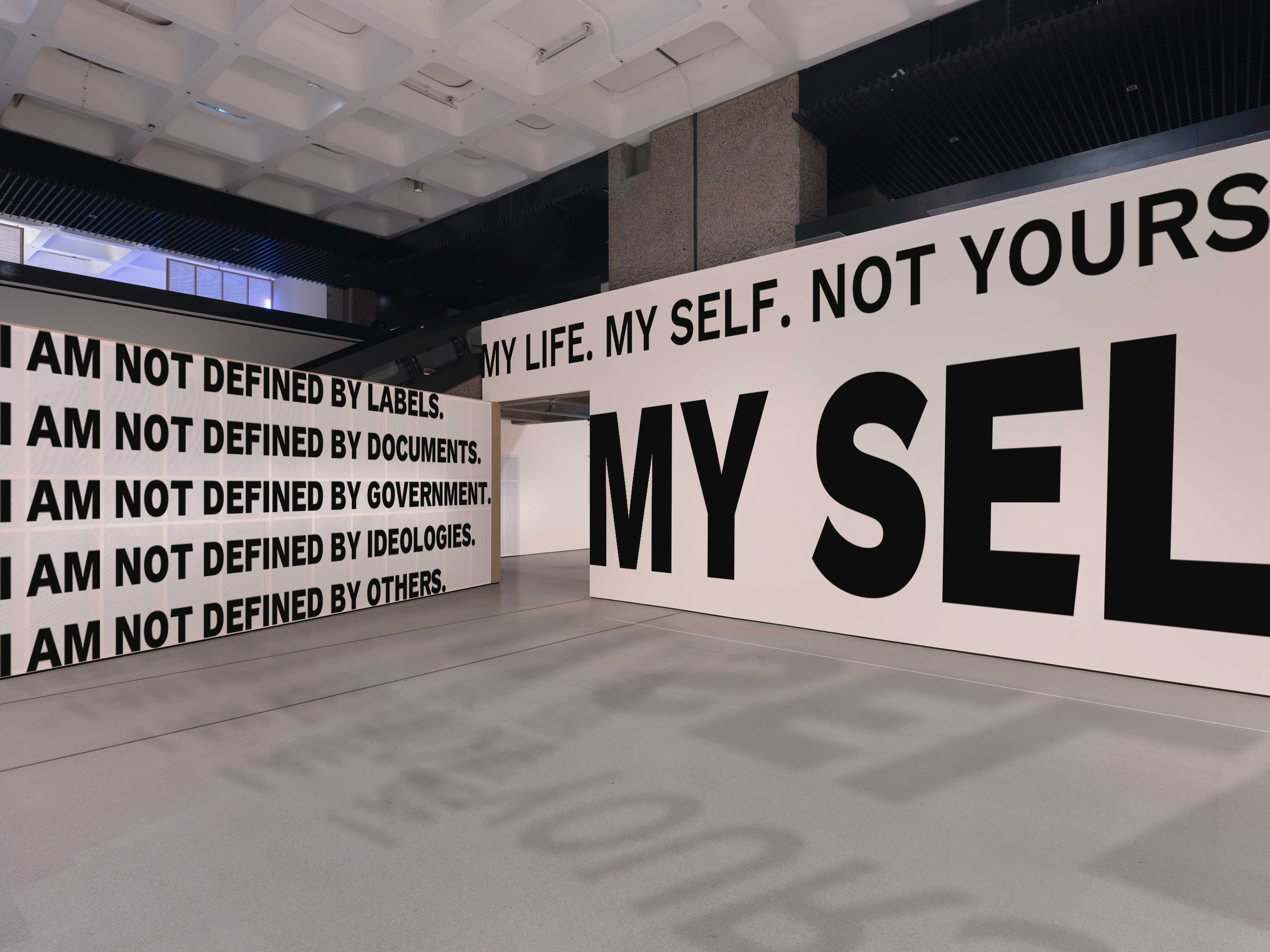
Artwork in Situ Mockups
At suggestion of my tutor, to begin to get a sense of this work installed in a space and how it affects the intersubjectivity between work and viewer, I have created a series of Photoshop mockups. Using images of Noah Davis exhibition hang obtained from the exhibition designers website (https://www.freehausdesign.com/noah-davis-at-the-barbican), I have explored altering the scale of the work and installing aspects of the copy onto the walls. These only a first pass, based on these first iterations of the copy, but they do accentuate, powerfully, the message carried. More experimentation is needed with the aesthetics of the copy – quiet-loud, fast-slow, angry-sad-happy-resentful – and then a re-install based on those experiments. That will all follow at some point.
List of Illustrations
Fig.5. Banner, F (2011) Superhuman Nude [Inkjet with one colour screen print and one glaze on 300gsm Somerset Photosatin paper.] At: https://www.countereditions.com/artists/fiona-banner/fiona-banner-limited-edition-print-1249u.html (Accessed 03/05/25)